Blacklisted
April 9th: Our dedicated FurID gallery is now live. Thank you all for the submissions to our little April Fool's prank, we hope you had as much fun as we did!
April 7th: It's that time again e621! The 2025 staff drive will be opening later this week! Please get your resumes and forklift licenses ready and keep an eye on the news/forums. Hope to see some fresh meat for the salt mines.
We still have a Discord server, come talk to us!
Want to advertise on e621? Click here!
Are you an artist uploading your own art to e621? Get verified now!
You must be 18 years or older and agree to the terms of service to access this website.
Content that is commonly considered objectionable is blacklisted by default. You may remove tags from this blacklist using the corresponding menu item.
BranislavDJ
MemberHa? O.o
Icee
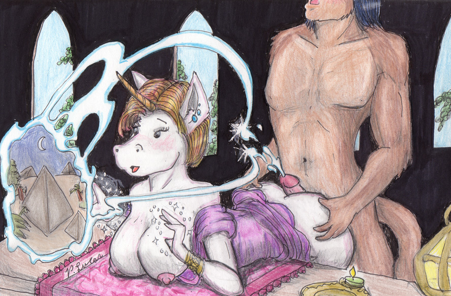
MemberWait wha? His cum makes a magical portal to Egypt? o_O;
FoxDevil333
Memberkkkkkkkkkkkkkkkkkkkk I'd lol at maximum!
sable
MemberAm I the only one who finds this guy's drawings really ugly? I mean.. generic anime whatever, yeah, cute enough, but just.. terribly executed. He needs to turn in his box of crayola pencils and take some classes.
Her shoulders are at a weird angle to the rest of her body, and it makes her spine appear to be bent at an impossible angle. And about that spine - where's her tail? He has a tail. Why wouldn't she? But back to the shoulders - they're at a different perspective than the table. It would make more sense if they were at more or less the same angle if she's leaning on it while anonymous dude bangs her. Speaking of him, look at his pecs - I am not the most diligent student of anatomy but I am positive that those are seriously fucking wrong. His right (our left) one is seriously lower than the other, way more than it should be - and his left (our right) looks like it's trying to escape the page. I can understand why it would want to.
The shadows on her body don't seem to coincide with any light source visible in the image - neither the diffuse daylight from the windows or the direct light from the little candle and lamp-thing (And daylight streaming in wouldn't leave the walls as pitch-black - it would light up the room!). I think he might be trying to suggest that the spooge-portal-thing is casting light of it's own, but I don't know. It looks pretty bad in any case.
There's basically no background. The suggestion of windows and the scribble-trees are so lazy as to be non-existent, which is a symptom of 'Fuck the Background I Want to Get Off' syndrome, where an artist is fapping as he draws. This syndrome is widespread in the art community, so in this at least he's not alone. The image would probably have been better served if he hadn't even bothered - the characters in pure darkness with only the light of a candle and a spooge-gate would have been much more effective and mysterious. I guess. Oh, and notice those windows - the sills appear to follow a perspective line, but the tops get taller so the arch is always almost at the top of the page. So are the windows getting larger the farther away they are? That's either really stupid design or really bad perspective. Take your pick.
Now, the technical aspects. His lineart is.. shakey, at best. It's like porn outlined in the style of the show Home Movies, only with even less appeal. Very few lines connect, and there's almost no variation in line width which looks intentional. And while there are styles very well suited to thin outlines, and broken lines can often add to an image, they fail to do so in this case. It looks amateurish and clumsy. The coloring is similar - it's rough, scribbley, and there's clearly little understanding of how to lay in tones and shades without pressing hard on the page. Colored pencils are similar to watercolors in that they are a transparent medium - the white of the paper shines through. So they work best when applied in layers with great care.
Or you can just SCRIBBLE AWAY.
Well, whatever. I've wasted enough of my time on this. Mr. Paul Lucas, if this is indicative of your work today, STOP IMMEDIATELY. Go get some art education, and then come back to us, a better artist and a better human being.
If you think you don't need to? FUCK YOU ASSHOLE CAUSE YOU'RE WRONG
Erk
Blockedhttp://telepromptedanthems.files.wordpress.com/2008/07/u-mad1.jpg
sable
MemberI loled.
zoron
MemberSpermGate!
Seppfox
MemberIt's just a picture man, holy shit, there's plenty of worse stuff on here.
What did this guy do to you?
Fursaffis
Member"Places you'd rather be while having sex with this person"
Fum
MemberJust because YOU don't want to see his art does not mean he should stop. FUCK YOU. Sure, he draws rather poorly, but he draws and is trying. Give him 5 years and hopefully he will get a book about drawing and be able to do nice pictures then. "Good artists are crappy artists who didn't give up."
Krayid
MemberWell in his defense he gave pretty solid constructive criticism. If nobody points out the faults, how will the artist improve upon them?
Blaziken
Member1.) Cool story.
2.) This isn't the place for your criticism.
sable
MemberEvery point I made is valid and reasonable. And pointing out the mistakes and offering advice for ways to improve is the heart and soul of critique. My points are not the slightest bit less valid just because I didn't state them in a coddling hand-holding sugar-sweet way.
Paul Lucas is an adult, I think. He doesn't need anyone to defend him. He needs to go learn to draw better. I wouldn't waste my time if I didn't think he could and should.
Furry art is so shitty precisely because noone will ever offer serious crit.
akeroh
MemberOk. First off, I promise you, Paul Lucas probably doesn't care if you badmouth his art here.
Second off, ANY piece of constructive criticism with the line "FUCK YOU ASSHOLE CAUSE YOU'RE WRONG" zips right out of the land of constructive criticism directly into the canyon of loud, ignored demands.
Also, Your points are not entirely valid.
Point #1
Body proportions/perspective is wrong.
Rebuttal-Picasso, one of the most respected and highly valued artists ever. Perspective/proportions are very, very far from anything resembling realistic.
Thusly, Artistic licence.
Point #2
Shadows are not in line with light sources.
Rebuttal-The background is not lit-I'll get to that in the next part. but the rest seems to be fairly lit to an out-of-frame light source above the characters, Thusly explaining why they do not have their entire front as shadows from the window. As well, shadows are not really important in a work-They are never a focus of the art, and all they do is add to the tone of the image. The tone here is not one that would be improved by darkness.
Again. Light sources don't have to be visible. There can be an infinite number of flashlights just off the field of view.
Point #3
Background isn't detailed.
Whoa. Holy shit. You mean the background isn't the focus of the picture? That a meticulously detailed background might, possibly, draw attention AWAY From the main focus of the image? Whoa. Yes. This should be signed into law. Every single picture must have background detailed to be picture perfect. Because it needs it. Yes.
Artistic licence, again.
Point #4
He has a style that is not technically perfect.
Ever think that maybe, that his style is a...I dunno...A style? I agree that you can get a ton of depth out of colored pencils, however, that's not required. Again, Art is entirely subjective.
Artistic licence.
If you really want to go complain about somebody's art, go to it on the 5 minute MS paint pictures that people only made because they wanted porn they didn't have. This actually has artistic value.
So yeah. take a chill pill. The great thing about art is that if you don't like it, you don't have to look at it.
godzillahatescheese
MemberHaha, wow. isn't this site basically about big-boobed mousegirls and horse herms with five foot shlongs? i think you're taking this waaaaaaaaaaaay too seriously.
You don't like the art, don't look at it. its that simple.
hoosherdaddy
Blockeddid you just compare this seedy furry porn to Picasso? I dont really care if you did, i just wanted to quote the longests most boring post ever
BranislavDJ
MemberCum to my world...
Foxen
MemberI would have to agree with everything you said, the guy needs work, though i do believe this is the first picture on this site to include a "sperm portal" you gotta give him that...
looking glass
MemberSable, you are an asshole. its not perfect, but I think its pretty good. Constructive critisism can be good, but if you say so much and resort to insults and personal attacks, that is just being an asshole. Art varies alot from person to person, work to work. all work has some flaws, even the mona lisa has them.
dragonlover91
MemberEveryone's a critic :/
Naruo
MemberThat said just one thing to say:
Artistic liberty rocks!
NeeChee
Memberjust stfu and fap!!
Chosso
MemberNone of that was criticism, just sure wanton name calling.
To all the people who see this comment, if you make an attempt at criticism then try to HELP the artist improve.
You have no idea the difference between:
"you fucking suck at lines, go die in a whole with along with everyone in your family."
and:
"Could of used a burn tool on the edges, otherwise good work."
Please, PLEASE, make an attempt at common human decency.
Just because no one can call you out to your face how big of a douche you are, and subsequently punching you many times, doesn't mean you should act like a total jaggoff.
Aurali
Blockedthe post was from 4 months ago and the comments have already been dealt with. Jeez.
You fuckers gotta stop trying to do my job. I got it! >(
Foxen
MemberPlease don't tell me your becoming another Mellis, he used to be respectable but the fandom eroded him into a hateful ass hole and a flat out jerk, just be careful missy.
ArmorPony
Memberwow
so nasty
Login to respond »